Walmart to launch a more personalized, redesigned website in May
Walmart today is announcing a significant redesign of its website which includes a visual makeover, the introduction of new personalization elements, as well as dedicated sections for specially shopping experiences. The company had already launched a revamped Home section on its site back in February, ahead of this larger redesign, and now plans to soon do the same for its fashion category later this spring. The forthcoming fashion hub will also include a Lord & Taylor online store, as a result of the partnership announced last year.
The Walmart redesign isn’t live today, to be clear. This is just the first look, before it arrives in early May.
The most immediately visible change is to the site’s look-and-feel.

The photography used on the site will include “relatable” photos of real-life moments, says Walmart.
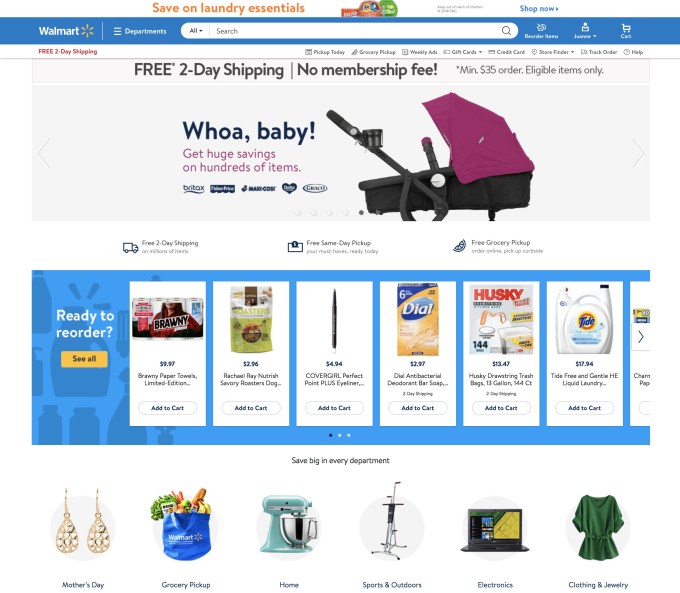
The pages also have a cleaner, more modern design, with pops of color from an expanded color palette, a new set of simply designed icons, rounded “add to cart” buttons, new fonts, and many other changes. Walmart says the goal was to bring more vibrancy and depth to the site.
While consumers may notice the how the site looks different, the larger changes are under the hood.
The new site will be personalized to end users, both on a regional and individual basis.
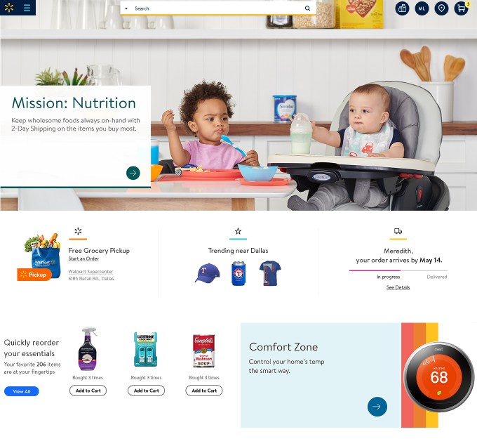
For starters, the site will showcase what items are trending in shoppers’ area. This is something you see elsewhere on e-commerce sites – like Instacart’s grocery shopping site. But it’s not that interesting to find that spaghetti sauce and La Croix are popular nearby – on a broader e-commerce site, it could be more useful.
During tests, Miami shoppers found that a top-selling item was an Ozark Trail pop-up tent, and in some parts of Illinois, shoppers saw Chicago Cubs tumblrs trending, for example.
“It just really kind of brings that [regional] flavor to life,” says Marc Lore, Walmart’s CEO of U.S. E-commerce. “You want the site to make shopping faster and easier, and when you’re showing those items that customers are trending towards, you’re actually making a faster shopping journey for them, which is ultimately the goal,” he says.

Customers will also be able to see what services are available in their area, like Walmart’s Online Grocery, along with order status features, and Easy Reorder for re-buying their favorite items. (Pictured above).
In addition, the site will recommend products based on what consumers have been browsing and buying. This is an area where Walmart could potentially outclass its rival Amazon, assuming its technology is up to par.
Amazon’s recommendation technology has fallen behind over the years, as the site seems unable to differentiate between gifts for friends and family or other one-time purchases, versus things users regularly search for, desire and buy.
In fact, a humorous tweet about exactly this problem recently went viral, leading to a stream of people responding with their own funny (or unfortunate) examples of the same thing.
Lore claims that Walmart won’t fall prey to this issue.
“The way we attack this problem is not through technology alone,” he says. “We’re able to combine technology and the merchandising elements to create a much more relevant and personalized experience.”
Walmart’s algorithms are meant to understand what categories the individual likes to shop, and then leverages merchants’ understanding of what items are new, trending or seasonal to reach the right segment of potentially interested customers.
“It’s been this fascinating partnership inside Walmart to see the tech organization and the merchant org come together,” adds Jordan Sweetnam, SVP, Customer Experience & Product for Walmart E-commerce. “And based upon early customer feedback, it looks like we’re gonna see some pretty relevant results,” he says.

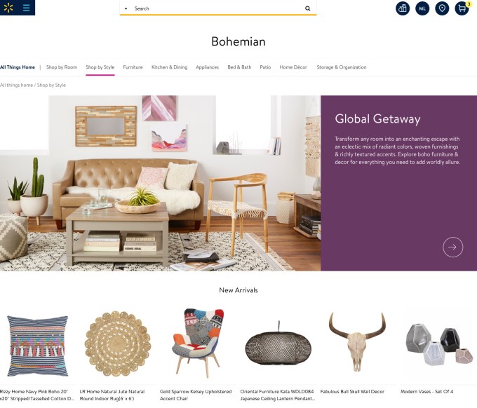
The new site will also be updated to introduce speciality shopping experiences for categories like home and fashion, which are seeing sizable growth online. The Fashion destination, which will go live after the redesign, will feature seasonal stories along with more editorial imagery as a means of differentiating the experience of buying a new outfit from buying groceries and household items.
Lord & Taylor will be a part of the new fashion destination, too, but more details about its shop will be unveiled later this spring. From what Lore says, though, it won’t feel like you’ve been redirected to a new site when browsing its shop.
The two retailers first announced their plans to team up online last year. Walmart.com was to offer its technology and reach to Lord & Taylor, while it gained the chance to upgrade its image as a low-cost – and therefore more low-end – retailer, and expand its assortment.
One goal with the site redesign is to attract similar brand deals.
“The Lord & Taylor partnership is hopefully one of many we’ll do over time,” says Lore. “A large part of attracting partners is to also have a more specialized shopping experience in that particular category.”
The redesign will begin rolling out to customers in early May.

 (@rosiebita)


