I’m in love with Astell&Kern’s crooked, beautiful, ridiculously expensive MP3 player
It may be old-fashioned, but I find dedicated MP3 players wonderful little devices. I’ve used tons over the years (the Zune HD is still the best) and I’m glad to see they live on in some fashion, even if it’s as an objet d’art jammed with audiophile knick-knacks and a $700 price tag: Astell&Kern’s A&norma SR15.
Look at that thing! The ground of the tech world is littered with anonymous-looking lozenges made to appeal to as many people as possible. Then you have this thing.
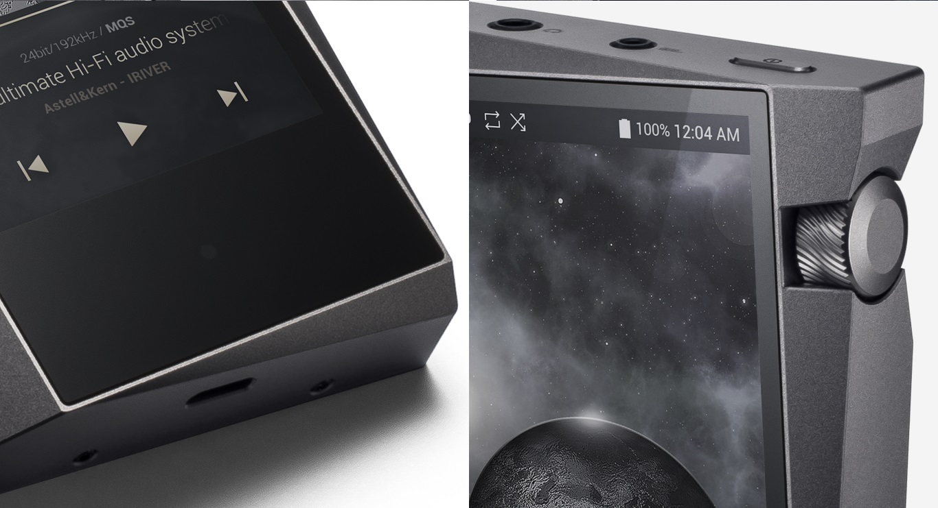
What a design choice, to tilt the screen like that and form the rest of the device from prism-like complementary rectangles! The site even has a “design concept” page, on which it points out that this isn’t a purely aesthetic choice:
The slight angle and precise, mindful alignment show the empty space and tones that fills the space.
From any angle, or either hand you hold your device, it does not hinder the display screen and offers the best grip.
Isn’t that wonderful? And it’s even kind of true! Those areas we so carefully avoid with our fingers or thumbs are now grippable.
 Meanwhile, the tilted screen also makes room for the knurled volume knob, while simultaneously protecting it from unwanted touches. And the angle of the screen makes for a visual hint for the power button.
I just love how risky this design is, how eye-catching, how simultaneously practical and impractical. We need much more of that in tech. This device has more personality than every iPhone since the 6 — combined.
 Inside is the usual blast of audio jargon: Cirrus Logic Dual DAC, native direct stream digital, 24-bit 192KHz playback, balanced 2.5mm headphone out and a quad-core CPU to support it all. Do you need any of that? Probably not, but a few people might, and at least you’ll be sure this thing will play pretty much anything you throw at it and sound great doing so.
I’ve used a few of A&K’s previous products, and can testify that they’re extremely well-built and feel great to use, though the screens are a bit low-resolution and the UI can be lacking. The 3.3-inch screen isn’t going to blow anyone away with its 800×480 resolution, but it should be sharp enough, and the UI got a redo between the devices I’ve used and the SR15. I’m eager to see if it’s more fun to use now.
The A&norma SR15 is available now for anyone with a pocket full of money to burn.

