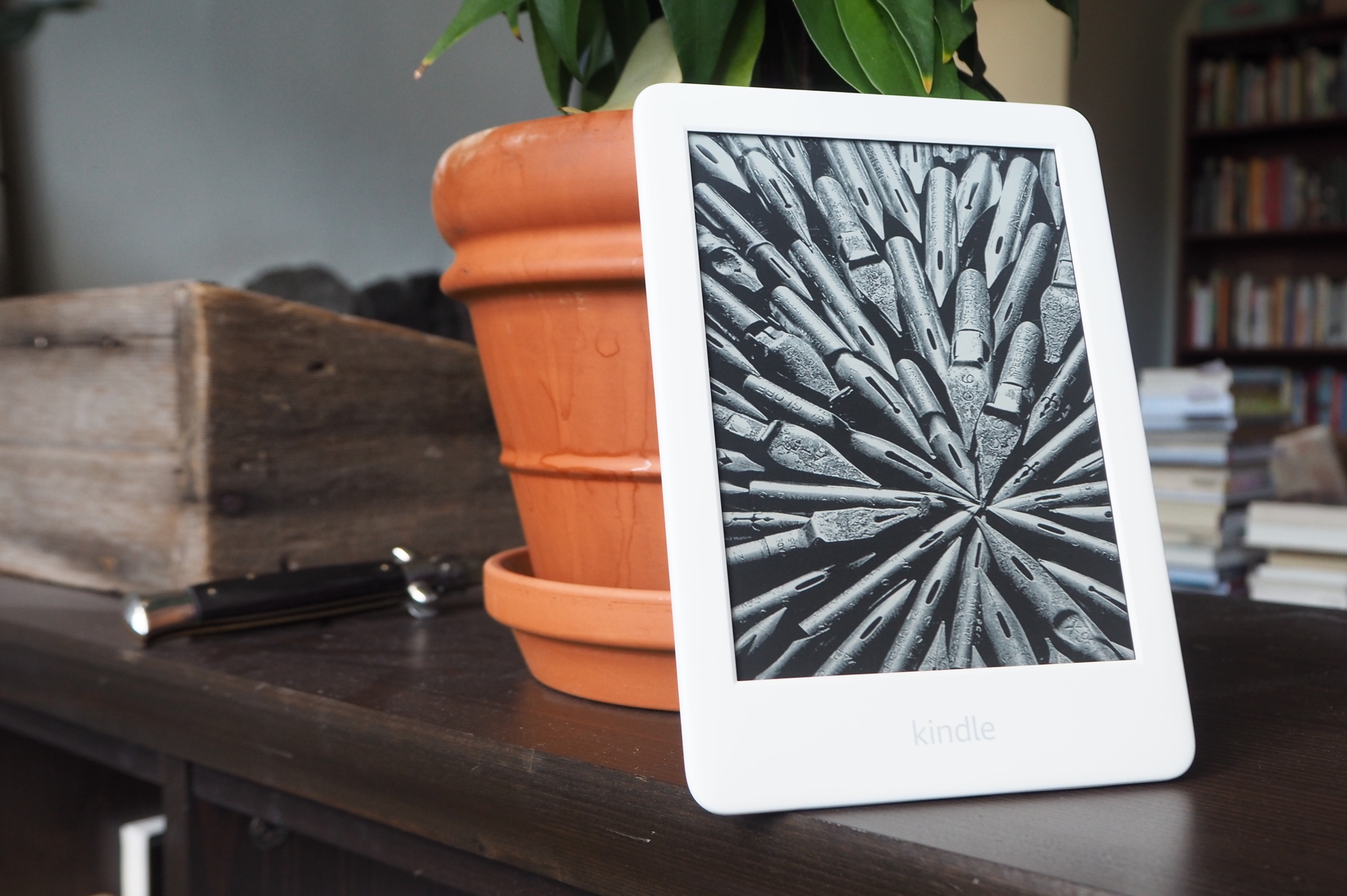
Amazon’s entry-level 2019 Kindle is let down by a sub-par display
Amazon’s Kindle is of course the brand most think of when they consider buying an e-reader, but competition does exist and the truth is it makes the company’s newest entry-level device look like a poor bargain. The price may be low, but this budget reader just doesn’t meet the bar.
The most basic current device in the e-paper Kindle lineup, the plain old “Kindle” (as opposed to Kindle Voyage, Kindle Paperwhite, etc) has in this 2019 iteration gained a couple features. An adjustable frontlight illuminates the E-Ink screen, there’s an improved touchscreen and a refreshed hardware design, though you’re forgiven if you don’t notice.
At $110, or $90 if you allow ads on your device, it’s among the cheaper devices out there, falling well below the $150 Paperwhite and $270 Oasis (again, subtract $20 if you don’t opt out of “special offers,” which I always make sure to mention).
 It runs the familiar Kindle OS and of course seamlessly connects to your Amazon account, just like the others in the lineup. In general it’s more or less the same as the others in terms of formats, store and access features, and so on. So you’re not sacrificing anything on that front.
Unfortunately, what you do sacrifice is something much more important: a decent screen.
We’ve been privileged in the last couple years to see the quality of e-reader displays improve considerably, both in terms of resolution and lighting. A couple months ago I reviewed the $130 Kobo Clara HD, which offers few frills and, frankly, inferior build quality, but a beautiful screen and color temperature-adjustable frontlight, which is really worth paying for.
The specs speak for themselves: the “all-new” Kindle has a 6-inch with a pixel density of 167 PPI. The Clara HD has nearly twice that: 300 PPI, like the nicer Kindles, and believe me, you notice. It makes a huge difference to how text looks — there are diminishing returns past that point, but the change from 167 to 300 is a big one. Letters look much crisper and more regular, and fonts look much more different from each other, allowing you to customize your reading experience a more. (I recently found out I can easily add fonts to the Kobo and it’s great.)
It’s hard to capture the difference between the two except in macro shots, but in person it’s a serious one. There’s a reason phones, tablets, and e-readers (including Amazon’s own) all went to high pixel density and never looked back.
[gallery ids="1810104,1810107"]
The Clara also has a frontlight that lets you adjust the color cast from cool to warm, which you can see above (I realize the temperatures of the images themselves are different as well but you get the idea). I didn’t think I’d find this useful, but as with resolution, it’s one of those things where once you have it, it’s difficult to go back. The cold, pixelated screen of the basic Kindle was unbearable after the warm, smooth look of the Kobo.
If you must have a Kindle reader and can’t spend more than $100, I’d seriously advise you to try to find an old generation of Paperwhite or the like with the higher resolution screen and frontlight. It makes a huge difference to readability and that’s really the most important part of a reader.
I would however advise you to spend a little more now to avoid buyer’s remorse. The Paperwhite is a great device and not too much more if you’re willing to accept Amazon’s “special offers.” Kindles in general have great build quality as well. If you aren’t attached to the Kindle brand, however, the Kobo Clara HD is only a bit more money and offers a better reading experience than either, in my opinion, as well as the flexibility that comes with the company’s devices.
When the entry-level Kindle gets a screen that matches the entry-level competition, I’ll happily endorse it, but for now I have to recommend its slightly more expensive peers for a major bump in quality.

