How to Start Using Color Correction in Adobe Premiere Pro

Color correction can have a dramatic impact on the quality of your videos. From home-made style videos which may be very yellow to professional-looking productions, getting started with color correction in Adobe Premiere Pro couldn’t be simpler.
Here’s everything you need to know.
Color Correction vs. Color Grading
Before making any edits, it’s important to clarify the difference between Color Correction and Color Grading.
Color correction is the process of “balancing” an image. This involves increasing or decreasing the exposure, contrast, and shadows, to reproduce what your eye expects to see, and what the scene actually looked like. While there can be some artistic choices made at this stage, it’s about reproducing the scene as it looked in real life, and producing a nice image.
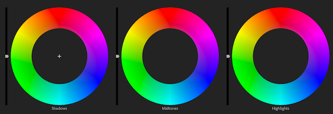
Color grading is usually performed after color correction. This involves changing the colors to something different. Films like The Matrix have a green tint, and many Hollywood blockbusters use a teal and orange grade. Color grading is as much about artistic choices as technical accuracy.
This tutorial will focus on the basics of color correction, although some of these tips will also apply to color grading.
Using the Lumetri Color Tool
The Lumetri Color tool is one of the most common ways to color correct footage in Adobe Premiere Pro. While there are other methods, along with different tools available in other video-editing packages, the basic concepts are the same regardless of your choice of tool.
Open the Lumetri Color panel by going to Window > Lumetri Color. Alternatively, you can go to Window > Workspaces > Color, to open the Color Workspace, which contains various different tools for analyzing and adjusting colors in video.

On your timeline, select the clip you want to start color correcting. The Lumetri Color tool will change from grayed out to colored, indicating that it’s ready to use.
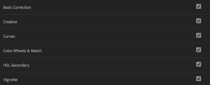
The Lumetri Color tool contains six tabs, each one containing tools for a specific color correction task. These are:
- Basic Correction: Tools for balancing the image, and correcting under or over-exposure, white balance, contrast, and saturation.
- Creative: Tools for working with LUTs, film grain effects, and color tint.
- Curves: Tools for adjusting hue, saturation, and contrast for specific colors or the whole image.
- Color Wheels & Match: Individual tools for adjusting shadows, midtones, and highlights.
- HSL Secondary: Tools for working with hue, saturation, and luminance.
- Vignette: Tools for adding a vignette.
These tabs may seem overwhelming, but it’s not as difficult as it looks. By clicking each tab, you can expand to see the tools and information for each section. The small checkbox to the right of the tab name will enable or disable that particular adjustment. This is a quick way to see a before and after view of some of your changes.
We’ve covered Color Wheels & Match in our guide to using the color match tool. In addition to that, our guide to making your own LUTs covers some aspects of the Creative tab. As color correction is different from color grading, these tips will focus on the Basic Correction tab.
Basic Correction in Adobe Premiere Pro
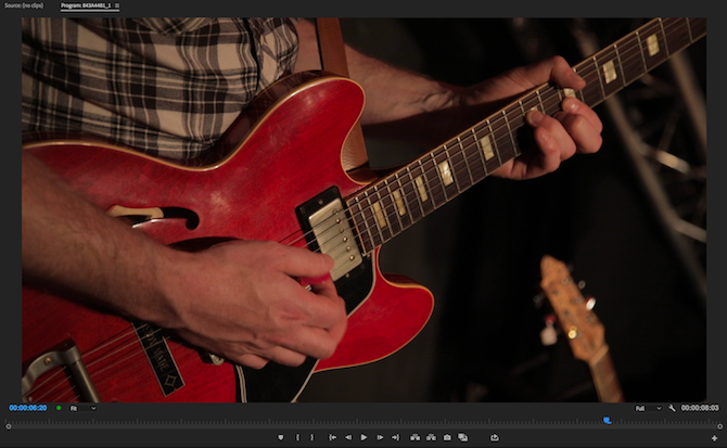
Here’s the footage we’ll be working with. It’s a close-up shot of somebody playing the guitar at a live music event:
Let’s dig into the tools found in the Basic Correction tab.
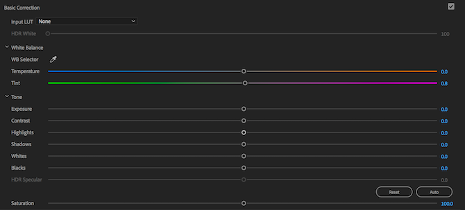
Handy Tip: when making any adjustments using the Lumetri Color panel, double-click a slider to reset it to its default value.
The first tool is Input LUT. We’ve discussed LUTs previously, and they are essentially the same as Instagram filters. You won’t need to use any LUTs when learning the basics—they can sometimes cause more problems than they solve.
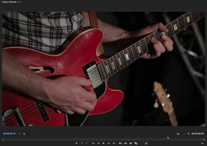
Moving on to White Balance. Here you can adjust the temperature and tint of the white balance. You can “cool things down” by adding more blue to the image (temperature slider to the left). You can “warm things up” by moving the temperature slider to the right (which in turn adds more orange).
By using the WB Selector, you can choose a point in your video which should be white, and Premiere Pro will attempt to guess the correct white balance settings. This isn’t perfect, but it can be a good starting point.
Here’s the example image after correcting the white balance. It’s not finished yet, but it already looks a lot better:
If you’d like to learn more about white balance, take a moment to read our guide to white balance.
Underneath white balance is the Tone section. This contains controls for contrast, exposure, highlights, shadows, and more. At the bottom right of these controls is a button labeled Auto. By pressing this button, Premiere Pro will attempt to color correct your footage for you. It doesn’t always do a great job, but it can be a good starting point.
Here’s our example image after pressing the auto button:
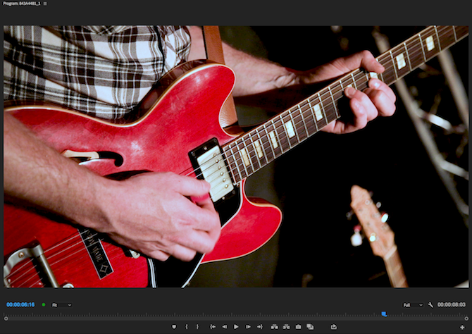
While this image has improved in some areas, the auto button has raised some new issues. Here’s what the Lumetri sliders look like now:

Premiere Pro has boosted the Exposure and Whites sliders, while making minor reductions to all the other sliders.
With each slider, moving to the right will increase the effect of that particular area, and moving to the right will decrease the effect. Here’s what they all do:
- Exposure: Brightens or darkens the whole image.
- Contrast: Add or remove contrast.
- Highlights: Brighten or darken only the highlights.
- Shadows: Brighten or darken only the shadows.
- Whites: Increase or decrease the intensity of any white pixels.
- Blacks: Increse or decrease the intensity of any black pixels.
- HDR Specular: Not available unless working with high dynamic range (HDR) footage.
By reducing the white level, and increasing the contrast, the image looks much better:
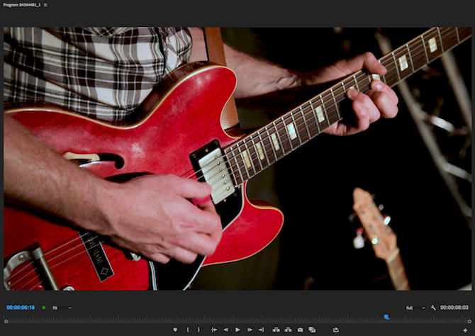
While each video is different, the best way to learn is by experimenting. Press the auto button, move the sliders to their maximum and minimum levels and take note of what happens. By increasing or decreasing the level of the shadows, for example, it’s possible to brighten or darken your video.
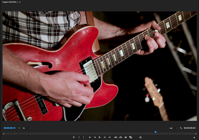
The final control under the Tone section is Saturation. Saturation alters the intensity of the colors in an image. By moving this all the way to the left, the image will become black and white. All the way to the right, and it will become saturated. Colors will look unrealistic and fake.
Like many adjustments, small changes can make a big difference. There’s no need to make big extreme changes. The colors in the example shot are quite bright and vivid, so a slight reduction of saturation by 10 percent is enough to improve the shot:
Kick Your Premiere Pro Skills Up a Notch
The before and after images of the example color correction shot show what a big difference color correction can make. Often, it’s only when looking at both versions of an image side-by-side you see how bad the image was before you applied color correction.
While there are many other tools available in the Lumetri Color panel, mastering the basics will give you an excellent foundation to build upon. If you’re finding that Premiere Pro is slowing you down, take a look at these Premiere Pro speedy workflow tips.
Read the full article: How to Start Using Color Correction in Adobe Premiere Pro


